The Holiday Time travel agency website specializes in B2C services.
BACKGROUND
The Holiday Time travel agency website specializes in B2C travel agency services. Their platform empowers users by providing information and resources necessary to make informed decisions when buying their dream trips.
PROBLEM
Holiday Time, one of the many travel agencies in the market, wanted to improve user experience by redesigning their website platform, addressing the need for an organised search bar.
SOLUTION
The search bar I made was designed to offer comfortable trip searching for both seasoned travellers, as well as those with less experience. The new search bar has been developed to make the process of selecting the destination, date, and number of people for the trip easier.
Roles
UX/ UI Design
Tools
Figma
Process
Discovery, Ideation, Design
1. Discovery
Holiday Time seeks assistance to empower users. Their main product needs surround the implementation of a new search bar for easy selection of destination, date, and number of people.
Secondary Research
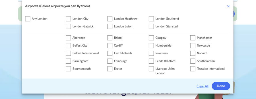
I analysed websites extensively to create an inspiration board that informed my design approach, gaining valuable insights into the different search bars and design patterns of competitors, for example, which facilitated a strategic and informed project development.
For this business
For this businessFor this businessresearch is key
How might we…
alter the original website design to offer more comfortable trip searching for both seasoned travellers and those with less experience?
2. Ideation
USER STORIES
"As a user, I want to be able to
find my dream holiday as easily as possible."
choose the right date that works for me.”
3. Design
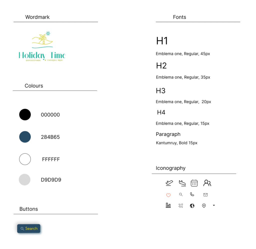
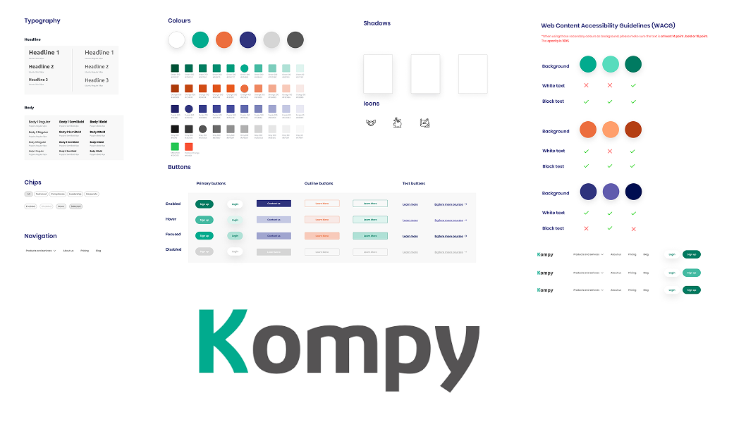
STYLE GUIDE / DESIGN SYSTEM
This style guide will revitalise the interface by bringing organisation and consistency to the current design.
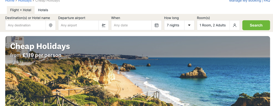
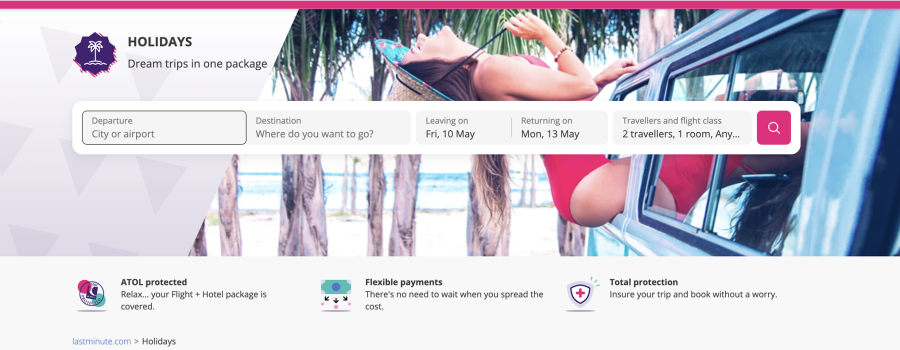
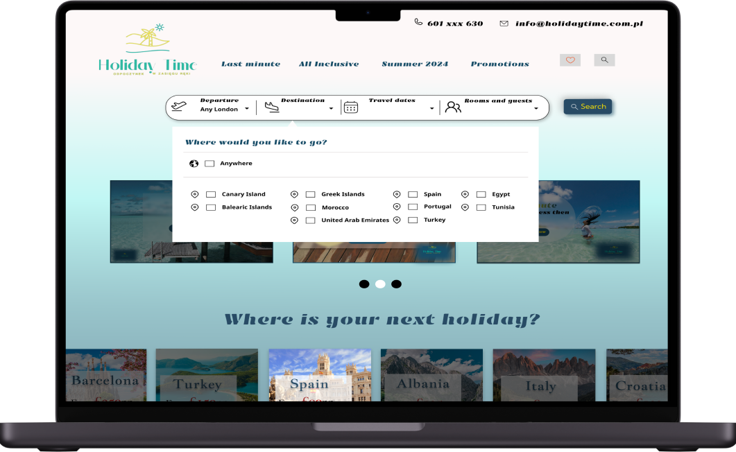
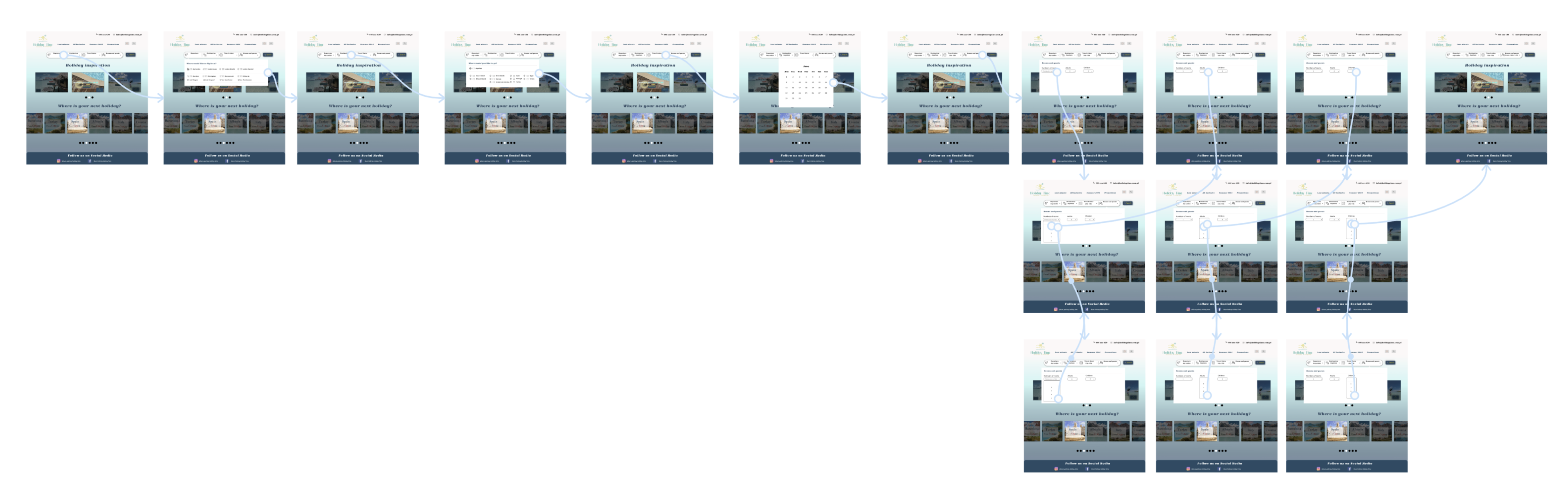
HI-FIDELITY DESIGN
In Figma, I designed the final screens with a strong focus on an easy to use search bar. These screens aim to instill confidence and reliability in the user experience, reflecting the brand’s commitment to trustworthy interactions.
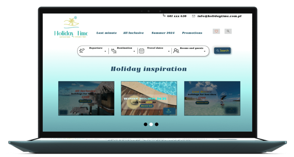
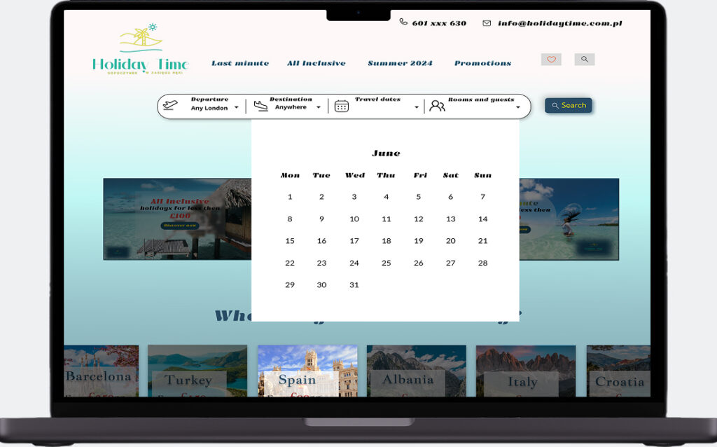
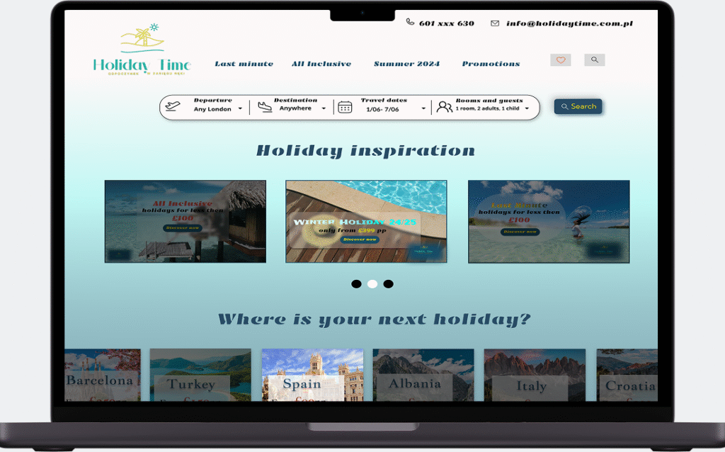
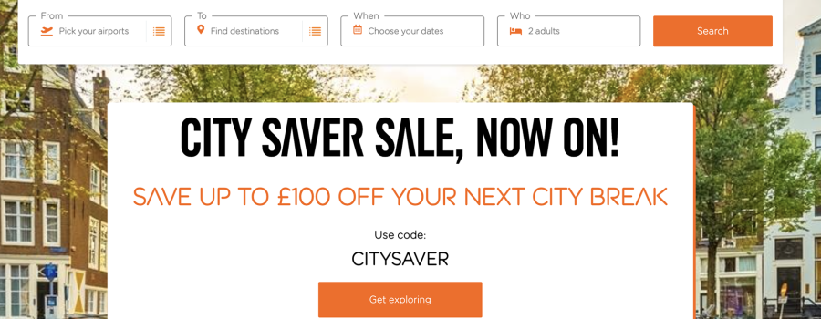
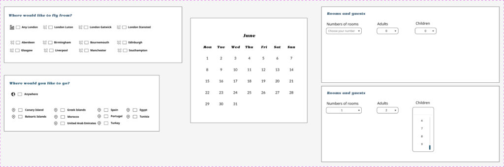
SEARCH BAR
The search bar empowers users to exercise control over the information they provide, playing a significant role in supporting the buying and planning processes necessary to build an online dream holiday.
The search bar aims to provide potential holidaymakers with essential holiday information, including:
Departure
Destination
Travel dates
Rooms and guests
BACKGROUND
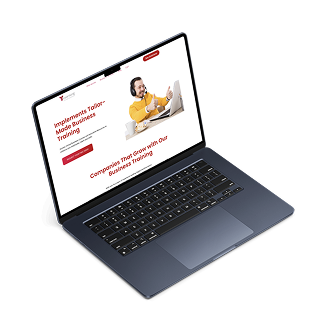
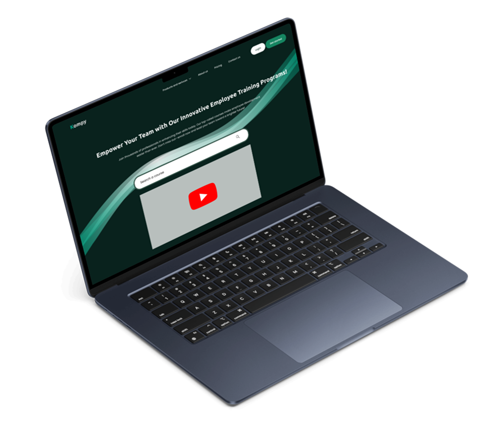
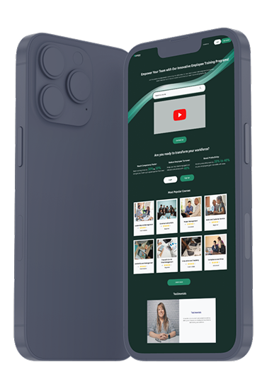
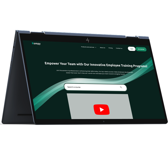
Kompy is an innovative training platform that builds on traditional T-Learning, offering a more modern, user-friendly solution for corporate development. It supports employees across all levels with personalised learning paths, easy course discovery, and an accessible interface to promote continuous upskilling.
PROBLEM
Users struggled with poor navigation, inflexible content formats, and limited support for different digital skill levels. As a result, training felt disconnected from their daily needs, leading to low completion rates.
SOLUTION
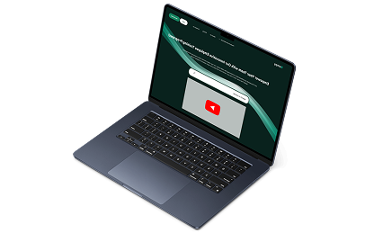
We redesigned Kompy with a user-centred approach, informed by research and real employee needs. The new platform offers tailored learning paths, interactive formats, improved searching, and a clean, accessible interface across devices.
Roles
UX/ UI Design
Tools
Figma
Process
Discovery, Ideation, Design
1. Discovery
To uncover key pain points in the existing internal training system and gain a deeper understanding of employee learning behaviours.
User Research & Insights:
Through user interviews and behavioural data, we identified three core personas:
Chris, a junior IT specialist, prefers interactive, bite-sized content in the morning.
Sophia, a senior customer support expert, would like leadership training and live interactions in the early afternoon
David, a veteran accountant, enjoys structured reading and recorded sessions after 4 pm.
Secondary Research:
Compared existing e-learning platforms to define best practices in content delivery, accessibility, and user experience.
2. Ideation
USER STORIES
“As a support specialist, I want structured content that helps me grow into a leadership role.”
“As a senior accountant, I want easy-to-use resources I can access in my own time.”
“As a new IT employee, I want interactive training to develop my technical skills.”
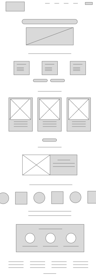
This wireframe shows a simple, user-friendly dashboard with intuitive filters and a modular layout — tailored to different roles and learning preferences.
Personal alignment:
A noticeable increase in employee engagement
Higher course completion rates
Positive feedback on improved navigation and overall clarity
A platform ready to scale with the organisation’s evolving needs
4. Key Outcomes & What’s Next
The redesign of Kompy led to:
✅ A noticeable increase in employee engagement
✅ Higher course completion rates
✅ Positive feedback on improved navigation and overall clarity
✅ A platform ready to scale with the organisation’s evolving needs
By prioritising usability, flexibility, and personalisation, Kompy has set a new benchmark for workplace e-learning. The platform is now more closely aligned with employee needs and emerging digital learning trends. Planned enhancements include collaborative learning tools and improved mobile functionality.
We use cookies to improve your experience on our website. By continuing to browse, you agree to our use of cookies.